Animating using Flat Planes in Maya
11 Aug 2019
Last year, I worked on a short called Midland Safari Putt-Putt, which I animated in Maya using flat planes. I picked this method because I was the most well versed in Maya (as opposed to another animation software like Harmony or After Effects), but I didn’t have time to go through the entire 3D pipeline. However, I really wanted to tell this story (which is true, by, the way). So, I had the option of scoping my project by a) using the workflows I was familiar with (i.e. modeling, texturing, rigging, animating, figuring out shots, rendering) to make something really short and small, or b) figure out a new way to make what I wanted. This project taught me that Maya (and any other software package) should be treated as a tool, and the way it is “supposed” to be used or is “usually” used shouldn’t necessarily determine what kind of project you can make.
In this post, I’m going to go through each step in the process, and give some tips for people interested in this method to enable a quicker workflow for more ambitious commissioned animations or personal projects.
Storyboarding
I storyboarded this animation keeping in mind that camera angle would have to be set very early in the process, as changing an angle would require the creation of new 2d backgrounds. This differs a bit from 3d animation, where usually a whole environment will be modeled, and it’s easier to make camera adjustments. Below you can see the storyboard.
Here are some of the storyboards next to the final render for that shot

Left column: Storyboard
Right column: Final animation
I storyboard on paper, and use sticky notes to write in dialogue and SFX. So far, I have not found a piece of storyboarding software that allows me the same ease of iteration.
Modeling
There were two different types of characters in the animation – golf balls and the giraffe. For both of these, I drew the characters on paper and modeled them using planes. You can see the drawing below and how it compares to the model:

Left: Drawing
Middle: Wireframe
Right: Rendered Pose
I changed the face on the model to reflect more personality. The eyes, ears, horns, and mouth are all separate pieces of geometry, which I’ll discuss more in the rigging section. Additionally, the back legs are a darker material, to give a stronger perspective. For the last shot, I made a front view of the giraffe as well:

Sculpting and retopologizing a giraffe would have been waaaay out of scope, but drawing and matching the geometry of these planes only took a few hours. I also experimented with duplicating all the geometry and making it black so that it’d look like outlines, but I ultimately decided against it.
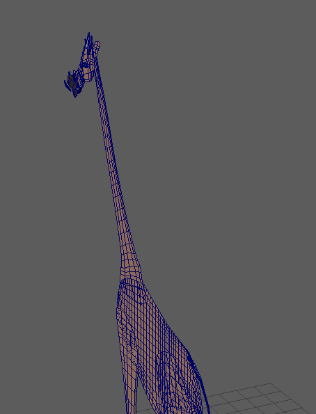
The giraffe model from the side
For the golf balls, I created four separate rigs for 0, 45, 90, and -90 rotations. I got this idea from looking at how 2d cutout animation is created, with a model sheet of different views of the character. I created the 45 degree rig first, and from there, it was pretty easy to scale the pieces of geometry for the other views. You can see some of the different views I created for each golf ball below. For every character, I modeled as if the “Front” orthographic camera was the render camera, which I’ll discuss more in the rendering section.

My concept art

These are all separate models, not one model from different angles.
Here is the rig I created for the -45 degree view. You can see that, unlike the giraffe, the golf balls actually used a sphere, which led to a different aesthetic on the ball. I knew that overlapping action would be very important for making the golf balls appealing, so I made three finger and toe segments, as well as separate hand geometry. The eyelid, pupil, iris, and eyelashes are all separate pieces of geometry as well.

For some shots in the animation, I used images of actual objects that I found online. This is because I’m lazy and didn’t want to model all these props (do you sense a trend). My workflow for those was as follows:
- Step 1: Find an image that I like
- Step 2: Open it in Photoshop and delete the background. Do this while watching Netflix because this step is very boring.
- Step 3: Save as PNG
- Step 4: Make an alpha mask of your images. Also watching Netflix.
- Step 5: Save as PNG
- Step 6: Apply an aiStandard surface to a plane (with Opaque box uncheck in the Arnold Tab of the shape node), and load the image PNG into the Diffuse channel and the alpha into the Opacity channel.

Left: Cake texture and alpha
Middle: Cake appearance in viewport
Right: Cake rendered
However, as you can see from the image above, when an object has transparency via an Arnold Shader, the transparency doesn’t show up in the Viewport. Using a Lambert with a PNG texture shows the transparency in the Viewport, but when Arnold renders it, the transparency shows up as black. A catch - 22! As such, in shots with a lot of these objects, it was hard to tell what objects were where:

left: viewport
right: render
Rigging
The rigging process was fairly similar to how one would rig a regular, 3d character – I used joints, skinning, constraints, and controllers. Rigging is one of the areas where this workflow shines – Maya has an incredible rigging toolset, and allows for much for sophisticated setups than, say, DUIK. For blinking and lip sync, I created blendshapes.
With the giraffe rig, I primarily used skinning to attach the geometry to the bones. I’ll go through the features of the rig below.

Overview: The giraffe rig has a global positioning/scale control, and a root controller if I wanted to move the body while leaving the feet in place. All of the geometry was skinned to the joints, except for the head, which was parented under the head controller.
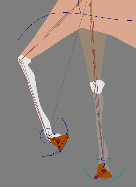
Feet: The giraffe had IK feet, as well as an ankle controller to rotate the ankle and hoof.
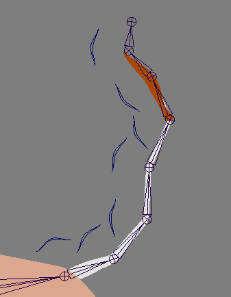
Tail: FK joints, pretty standard. If I were to make the rig more robust, the first thing I would do is create some driven keys with different poses for the tail.
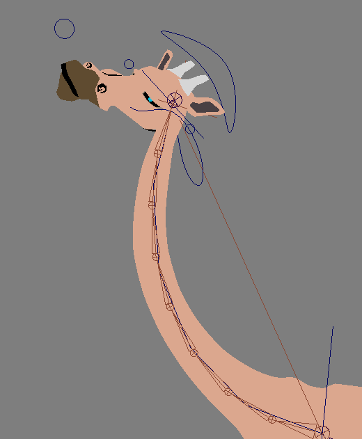
Neck: IK spline with a 9 -joint bind chain. There are two controllers at the top and bottom of the neck that control each end.
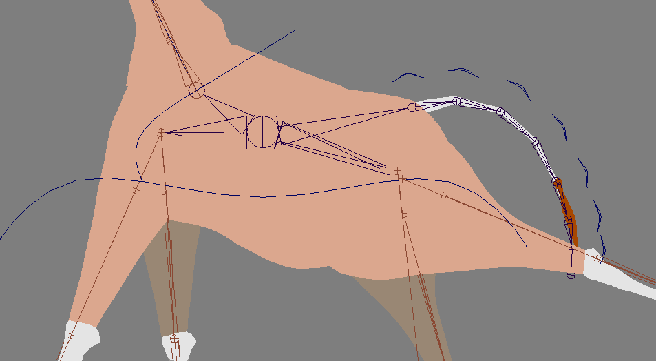
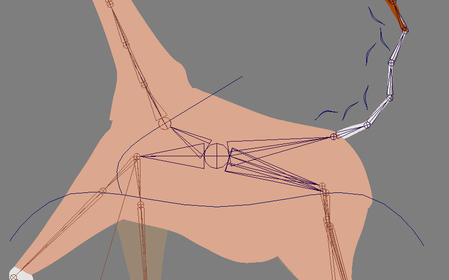
Body: Most of the body was bound to a central joint. The character’s movement was benefited by using smooth bind because it allowed influence from tailBase, upperLeg, and neck joints, leading to better deformations and a less “cut-out” look.
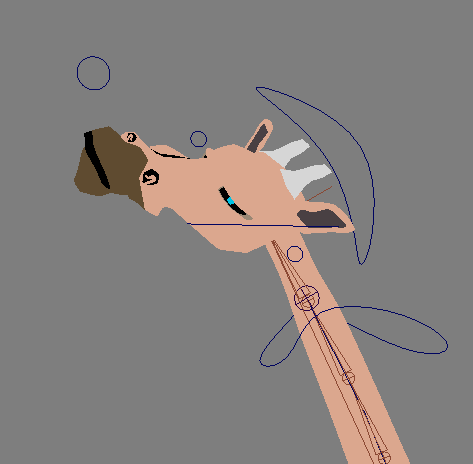
Head: All the head geometry was simply constrained to the head joint. I did this instead of skinning because I wanted to be able to move individual pieces of geometry, such as the ears and eyes. I figured if I bound everything, I was robbing myself of the flexibility of animating with 2D planes.
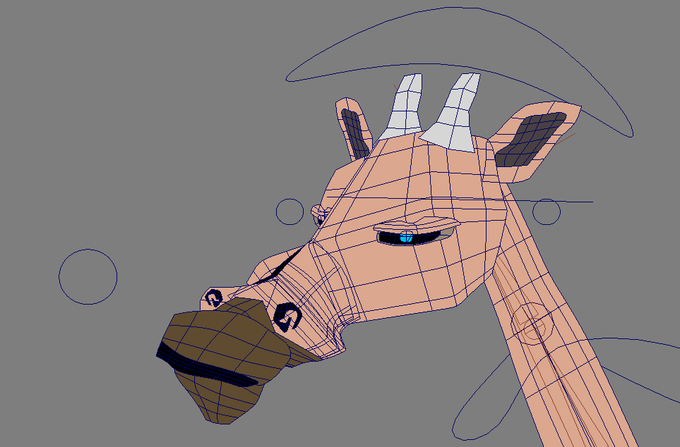
A closer look at the geometry in the face
Face: I created different phonemes for lip syncing using blend shapes. I used the following phonemes: A/I, E, O/U, F/V, C, L, M/B, and W/Q. I also misspelled “phonemes” in the Channel Box. Embarrassing.
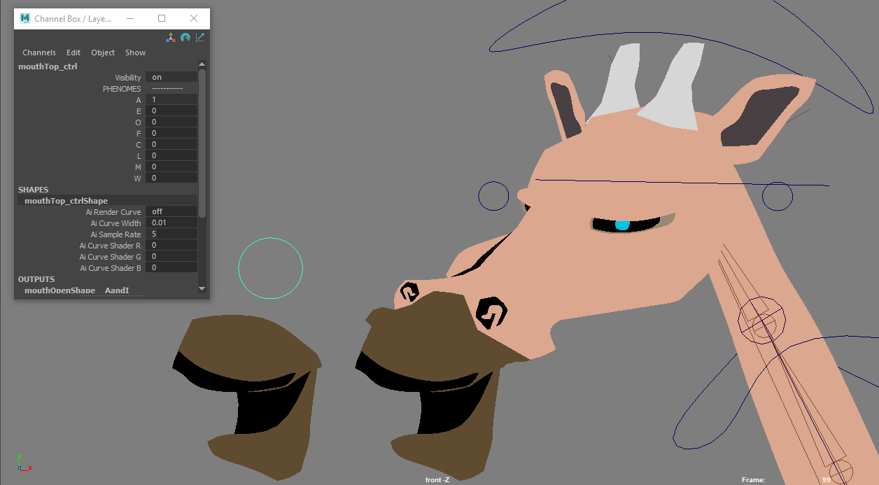
A
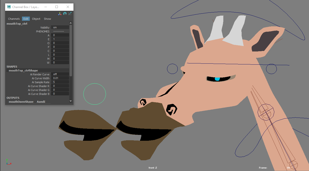
E

O/U
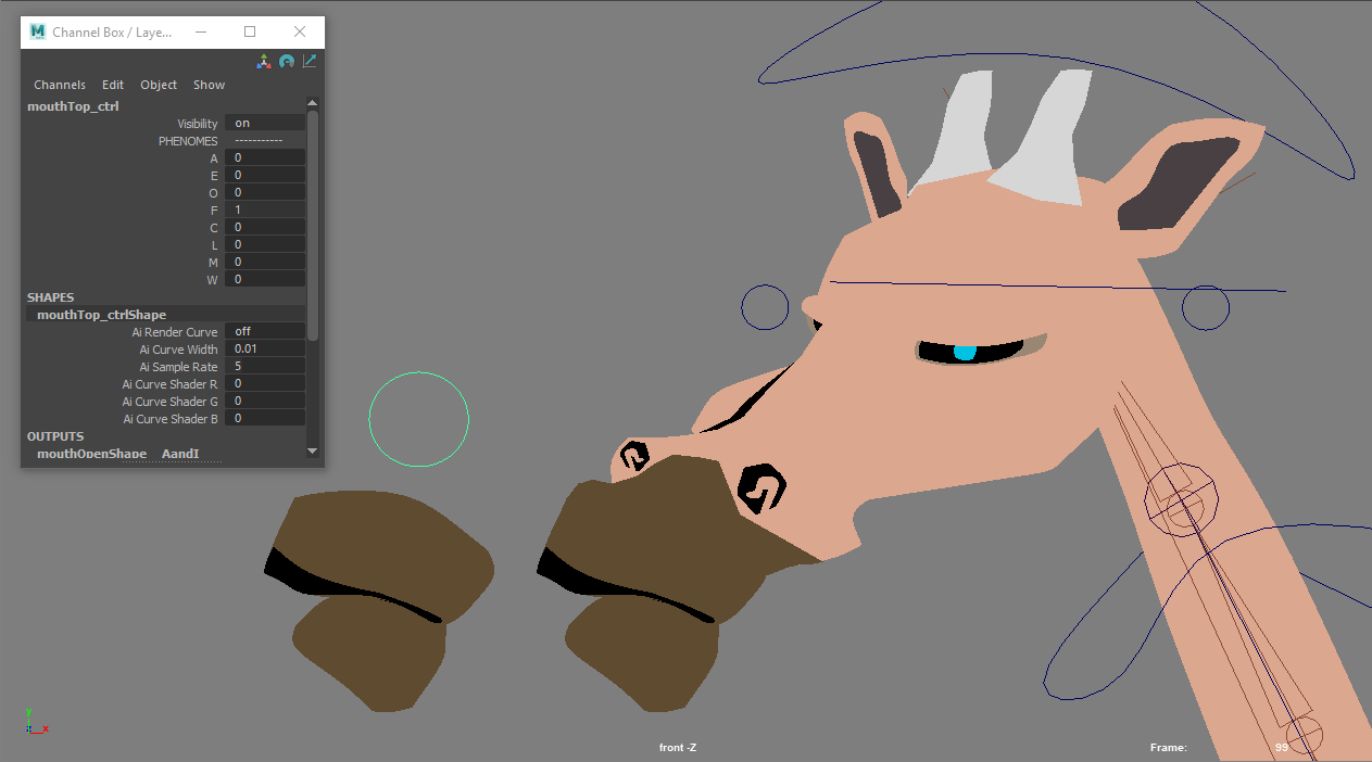
F/V

C
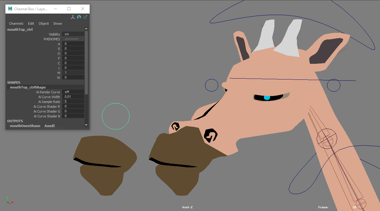
M/B
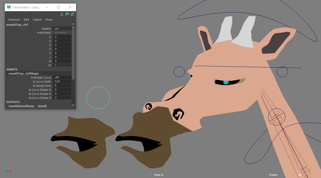
W/Q
I used the same process to create the phonemes for the front view giraffe rig (which did not have any skinning). I also used blend shapes to create some different eye poses.

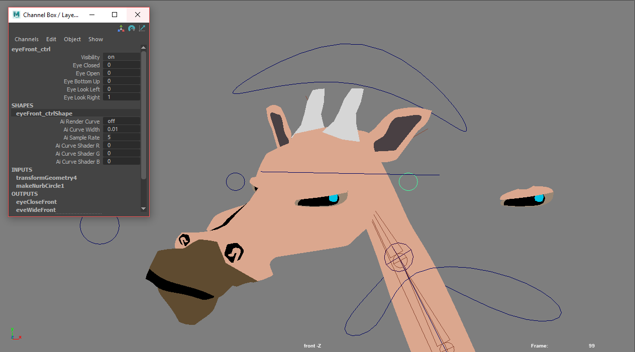
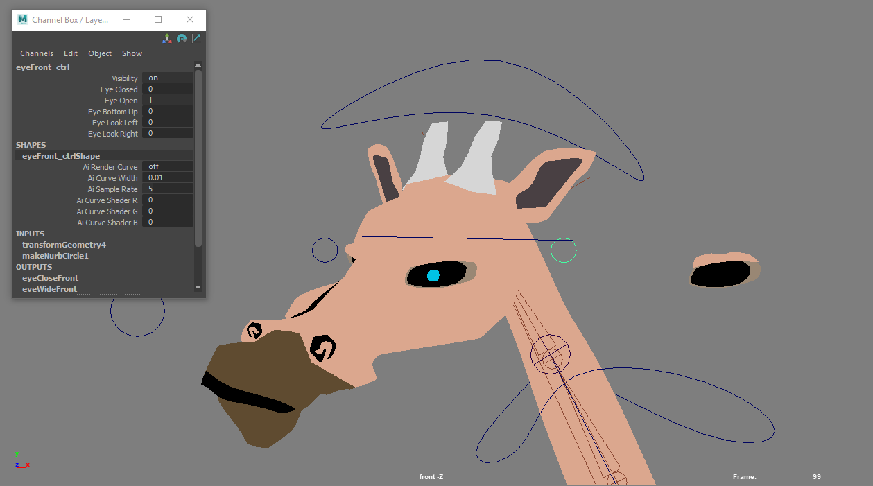
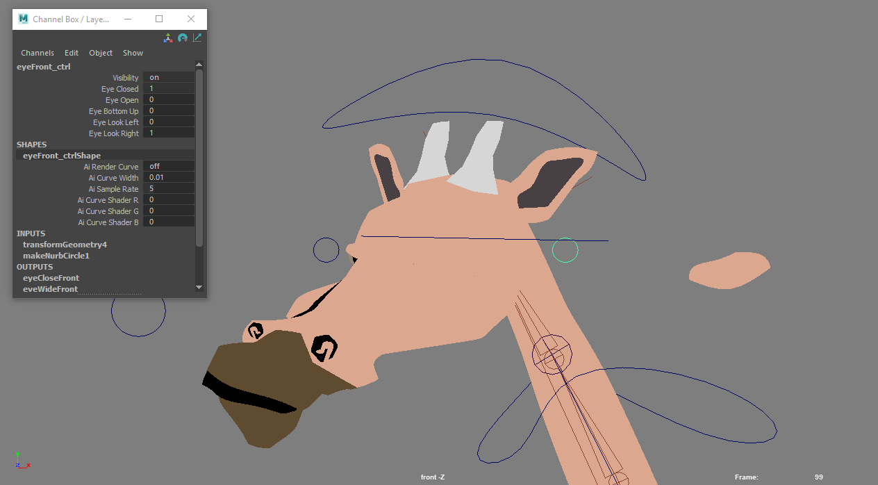

The golf ball rigs were really flexible. Below, I’ll go through the rig features and setup. I prioritized making the various parts of the character independently transform-able (is that a word?), so I opted for constraints or straight - up just putting the geometry under a controller in the hierarchy. I wanted independent transformations because I knew this would be important for overlapping action and subtle perspective changes.
The first rig I set up was the 45 - degree one. I’ll go through the features of that one below, and note when I was able export pieces and use them in rigs for the other views.

Overview: There was a global positioning/scale control (selected in the image above). If I wanted to move the body but leave the hands and feet in place, I would click on the golf ball and simply move it around, since the shoulder and hip controllers, as well as the extra pieces of geometry (eyes, bowtie), were parented to the golf ball. This setup would normally be very bad form – production rigs tend not to have things constrained to geometry – but it was perfectly serviceable for this workflow.

Arms: IK (the geometry was skinned the the joints). I used an RP solver so that I could flip the angle of the elbow, and added a Pole Vector constraint. I also added a shoulder controller, which was parented to the golf ball but I could move anywhere, and I found was very useful for conveying the weight of a movement. To move the hands, I simply manipulated the geometry.
I exported the rigged arms and was able to include them in the rigs for other views.

Feet: The feet setup was identical to the arms, minus the Pole Vector constraint, because I didn’t want the knees to ever bend backwards. I also controlled the feet by manipulating individual pieces of geometry. A nice thing about not skinning the hands or feet was that it allowed me to scale them – so if I wanted a hand or foot to flip, I simply hand to scale it to -1.

A closer look at the geometry in the eye
Eye: Since all the pieces of the eye were separate geometry, to control the character’s gaze, I just moved the pupil and iris around. I also created blendshapes for some different eye poses, which you can see below:


Animation
The 2D workflow didn’t really affect my animation process. I would Referenced my rigs and went for it! The floppy arms on the golf balls were very fun to animate, and it was nice to only have to think about one rotation axis…
Environments
I alluded to how I did the environments in the storyboarding section, but I’ll expand on it here. I would draw them out and then import the drawing as a free image plane and “trace” it with geometry. Obviously, this was not very flexible, so I had to pick my angles carefully and draw at the proper aspect ratio.

I started by drawing out a scene
Next I would trace it

Left: all geometry
Middle: with render gate
Right: perspective view of scene
I found that it was best to create an orthographic camera that would be my render camera early on, and tear off a window with that camera’s view so I could model in other views. I also would disable shadows and self-shadows so drop - shadowing wouldn’t betray the 2D setup. That being said, none of the characters and objects in the animation had shadows, which is not ideal.
The flags were nCloth simulations. I think it’s fun to use simulations with this method, and in the future, will probably try using Bifrost and nParticles. Anyway, I made an asset with the flag and a flagpole, and created a dynamic contraint between the nCloth and the flag pole. I found 20 to be the optimal wind speed. I would also start the simulation 10 frames early so that the flag would be fully waving by the time the shot started.
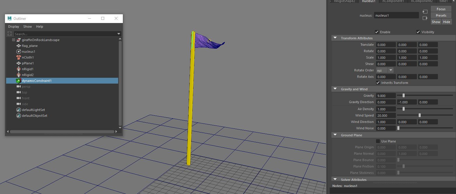
I just imported this scene into my other shots to place all the flags
Lighting and Rendering
Lighting was tricky, and was probably the most difficult and least intuitive part of this entire workflow. It’s the stage at which it was trickiest to wrap my head around using 3D tools for a 2D environment. I ended up using A LOT of spot lights with really high falloff, so that I could get light in the places I wanted but not have it light things that were further back in the shot.
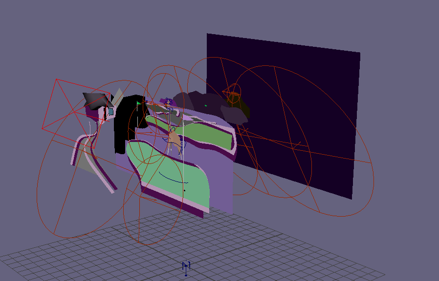
like I said, a lot of spotlights
I also favored lights with high intensity and bright colors. I took inspiration from neon golf courses. Since I used lambert materials, I used the lights to make the aesthetic more interesting. Ususally, I would use a blue aiSkydome light, and an spotlights to add variation. For example, I often used a pink spotlight on the giraffe’s face:

Right: With pink spotlights
Left: Without pink spotlights
In the shot below, I used a bright blue spotlight on the water, and a purplish one on the elephant and on the rocks.

In this shot, I used a green spotlight on the grass and a high-intensity purple spotlight on the rocks. The darker portions of grass in the front where achieved with a separate piece of geometry.

In this shot, I put a red spotlight on the volcano

For the sky, I would put a bright blue spotlight below the geometry and angle it up, and play with the falloff until i got a gradient that I was happy with:
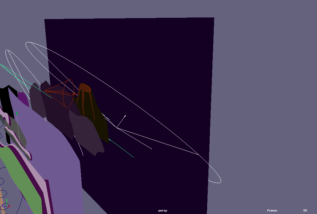
Sky spotlights (selected)

By contrast, in the shots of the houses under the course, I used more neutral colored lighting:

Since my geometry was not complex, there were no shadows, and I used only Lambert materials, the frames rendered super fast (45 to 120 seconds per frame).
If you’re using this method, make sure that your render camera is Orthographic. Select your camera, and under the “Orthographic Views” tab in the camera shape node, check the “Orthographic” box (shown below). When you use a perspective camera and you scroll the mouse, the camera “zooms” by moving towards or away from the object. Thus, you can move a perspective camera to control how large an object is in the Viewport. An orthographic camera is not like this. It zooms by adjusting the Orthographic Width:
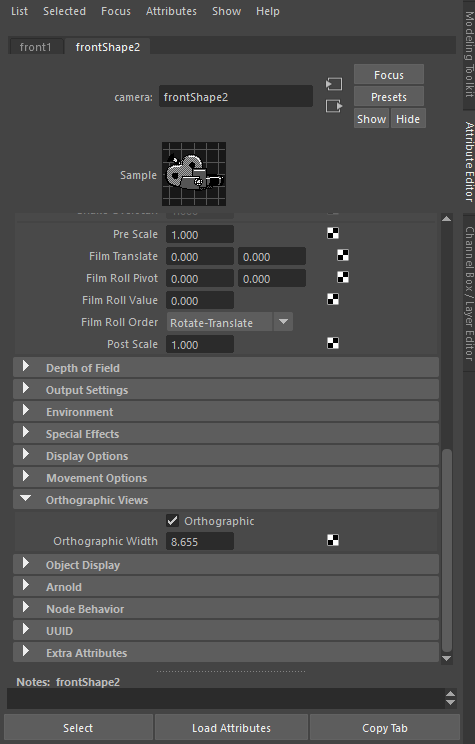
Moving it towards an object will not affect how “close” the camera appears to the object. Thus, when I wanted to zoom in on a part of my shot, I would adjust the Orthographic Width.
Conclusion
As you may have gleaned from the above content, there are pros and cons to this workflow:
Pros:
- You can create a lot more content much more quickly than a “traditional” way of using Maya
- Animators who usually work in 3D can take on 2D projects without having to learn or pay for a 2D package like After Effects or Harmony
- CG artists who specialize in one field can make entire works. I specialize in rigging and character animation, but my less developed skills in modeling, lookdev, and rendering were sufficient for this workflow
- Character setup is much simpler
- You can use Maya’s robust rigging toolset on 2D characters
- Fast render times
- You can put less effort in without having the obviously “half - assed CG” look
Cons
- High levels of planning are required to avoid extra rigging and environment work (imagine setting up a bunch of phonemes for a rig that doesn’t talk from that particular view, or needing to change the angle of a shot and having to completely redo the environment)
- Character’s can’t easily turn without betraying the edge of the plane
- Lighting is not intuitive
- Maya is set up for 3D, not 2D. A lot of thinking needs to go into how to leverage Maya’s 3D tools for 2D.
Hopefully this was helpful for people considering adopting this technique. It’s not totally novel – some other work that’s been animated using a similar technique is the Comedy Central series South Park and Please by Josh Swallow. However, it’s not totally obvious, and I think it’s very useful for people trying to do projects that would be totally out of scope in full 3D.


